New site, new logo, same Cell
Category: About
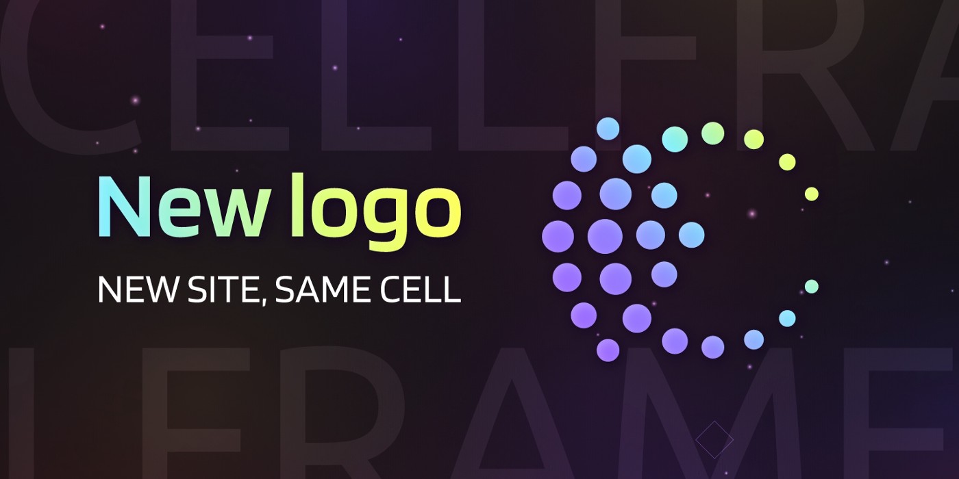
The community has been suggesting we change the colors of our brand for a long time, so we listened to the advice and changed not only the site but also the logo.
What’s up with the logo?
The new logo consists of points. It is reminiscent of the shards that make up the Cellframe network. We developed our blockchain on C, we are proud of this, so the letter C is also present. You can read, why the C language for blockchain is so good here. The stylized arrow is crossing C. It symbolizes the movement ahead, at the forefront of science. We made the logo rounded because a circle is a familiar cell shape.
What’s up with the colors?
The basic color of the brand is electric purple. This color is associated with science, post-quantum technologies, and progress. Lime is an accent color, which reminds the old school of developers.
What’s up with the site?
We repainted the interface in dark colors: this is in line with modern trends. We all love dark themes, so why not make the entire site dark?
Only the most meaningful information remains on the main page: what is a Cellframe, what it allows you to get, and why it makes a profit. All technical details and secondary blocks are now on subpages to make links more specific.
That’s all about the rebranding. The mainnet coming soon, in March 2022.
📣Media Links📣
🌍 Website
🌍 Telegram Ann
🌍 Telegram Group
🌍 Twitter
🌍 Discord
🌍 Twitch
Recent news
-
How to create your own Cellframe consensus
28 Jan 2022
-
AMA, December 30: the achievements of the year 2021
21 Jan 2022
-
AMA, January 20: changes and news
21 Jan 2022
-
Cellframe Network: Post-Quantum Encryption and Decentralized App
12 Jan 2022